- I’ll start with a question, which has always puzzled me.
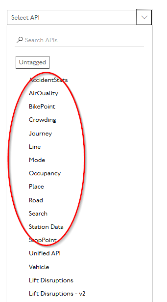
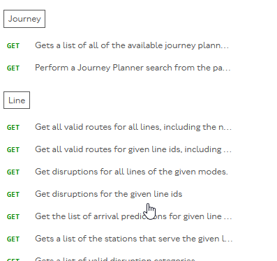
We have these categories:
And then we have the Unified API which appears to contain all the same categories over again:
I’ve always assumed that everything except the Unified API was historical duplicates that are only needed for maintaining old code, but am I missing anything if I stick exclusively to the Unified API?
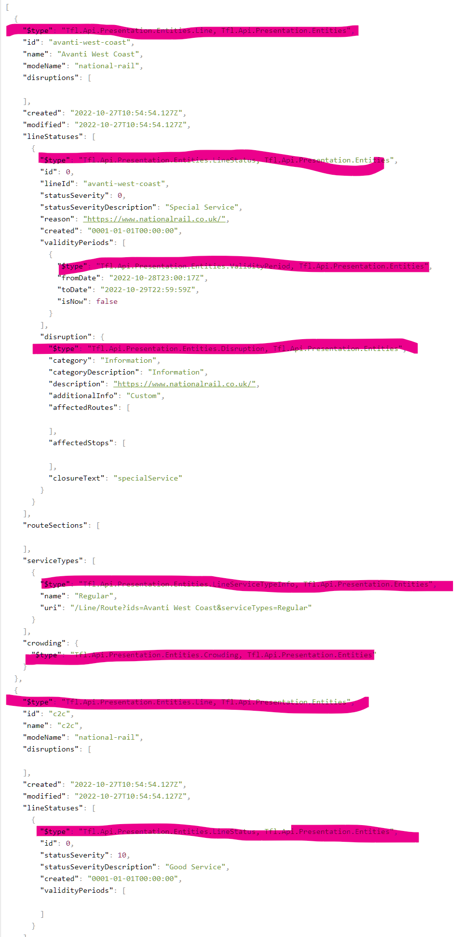
- Next, that second image reminded me … it’s not what any other user would (normally) see when they go to a page like APIs: Details - Transport for London - API.
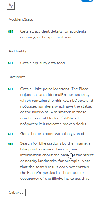
Normally you would get this:
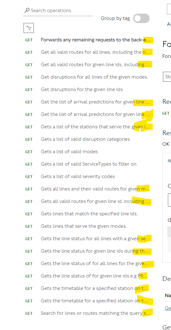
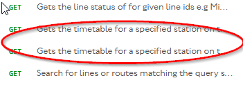
I found the truncated display completely and totally unusable, because often the important information distinguising two similar APIs is beyond the truncated area.
Sometimes they’re even totally indistinguishable:
I converted it to a scrolling column with some personal css, which probably does a number of other things too, most probably changing column widths and making them scroll independently, but I don’t remember exactly what:
.operation-name { white-space: normal; }
.nav { overflow-y: auto; display: block; max-height: 50vh; }
.ycqdvmhchp { overflow-y: auto; display: block; max-height: 75vh; }
.ycqdvmhchp { max-width: 1080px; }
.ijdrsuhpjk { max-width: 400px; overflow-y: scroll; height: 70vh}
.table-preset-head { max-width: 200px; }
.table-preset-head { max-width: 170px; }
.table-preset { overflow-x: auto; }
.meatiytmag { max-width: 2000px; }
.collapsible-container { max-height: 800px; }
.text-truncate { white-space: normal !important; }
I don’t suggest you use that css directly, because it might not suit everybody. But if you have a way of adding it (I use firefox with the stylus addon, which lets you easily turn user css on and off as and when requiired) it may give you some ideas to consider incorporating.
- Some other suggestions
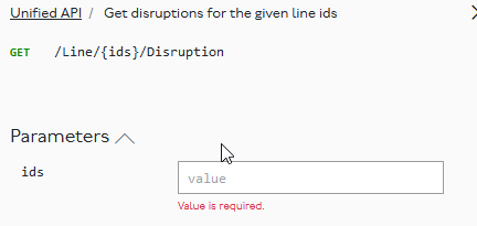
A user is likely to want to know what a valid value might be. The placeholder value isn’t helpful but the middle column provides the answer:
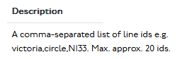
It would be much more useful if
- the placeholder said value, eg victoria or N133 and/or
- the description came immediately underneath it
So, something like:
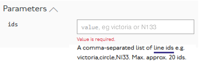
Note that I’ve added a link, which could sensibly execute the appropriate API call to display the possible IDs in a collapsible list
Likewise:
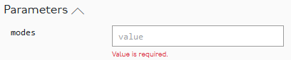
Here there is a relatively small list (20-30) of possible modes so although the placeholder could display value, eg tube,dlr it should probably be possible to create it as a multiselectable dropdown by executing https://api.tfl.gov.uk/Line/Meta/Modes.
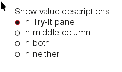
Most people probably wouldn’t need it in both places. So I’d suggest making their position optional:
Of lesser importance, but perhaps interesting:
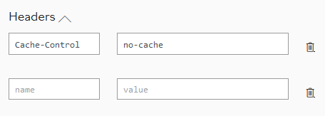
I can see that cache control would be relevant and guess what it will do. But the ability to add extra values suggests there ought to be a list of other possible headers that TFL recognises, and the supported values.
- Thankyou for giving us the opportunity to submit our ideas.
I presume the actual functionality of the API itself isn’t your department, but it has major failings. One if them is that it is often totally impossible for a freedom pass user to get a journey plan between certain destinations within the freedom pass area that doesn’t use invalid trains for part of the journey. It would presumably be possible to add a Freedom Pass parameter to the JP API (the same way as step free access filtering works) and add an FP flag to each record of the timetable information to ensure they aren’t given unsuitable journeys. But TFL has been silently ignoring that requirement for more than 5 years.
Likewise, I presume the user interface for the journey planner is nothing to do with you, but there really needs to be a similar consultation on that. Some of its user interface features are not just inconvenient but positively user-hostile. I’ve raised some of them here:
Buses that disappear from predictions API – which is a much bigger problem than I’ve so far reported, and makes journey planner, the journey planner API and the countdown displays at bus stops all totally unusable in the Chingford area. And probably many other places too.
Disambiguation Errors is an irritation. Frequently circumventable if you know what you are doing. But the average person shouldn’t be expected to do that. I note I even said in June 2018 in that thread “I’m probably wasting my time reporting another bug, because nobody seems to be fixing them.” Clearly I was, because they’re still not fixed. Even today, journey planner still thinks Glyn Road, Enfield is somewhere near Cricklewood instead of being in Enfield.
Unnecesary disambiguation in Via field – yet more user hostility, where in some cases JP requires disambiguation for stations like Liverpool Street and Stratford that the user has already disambiguated by picking them from JP’s own dropdown list. All much more recent, but also not fixed.