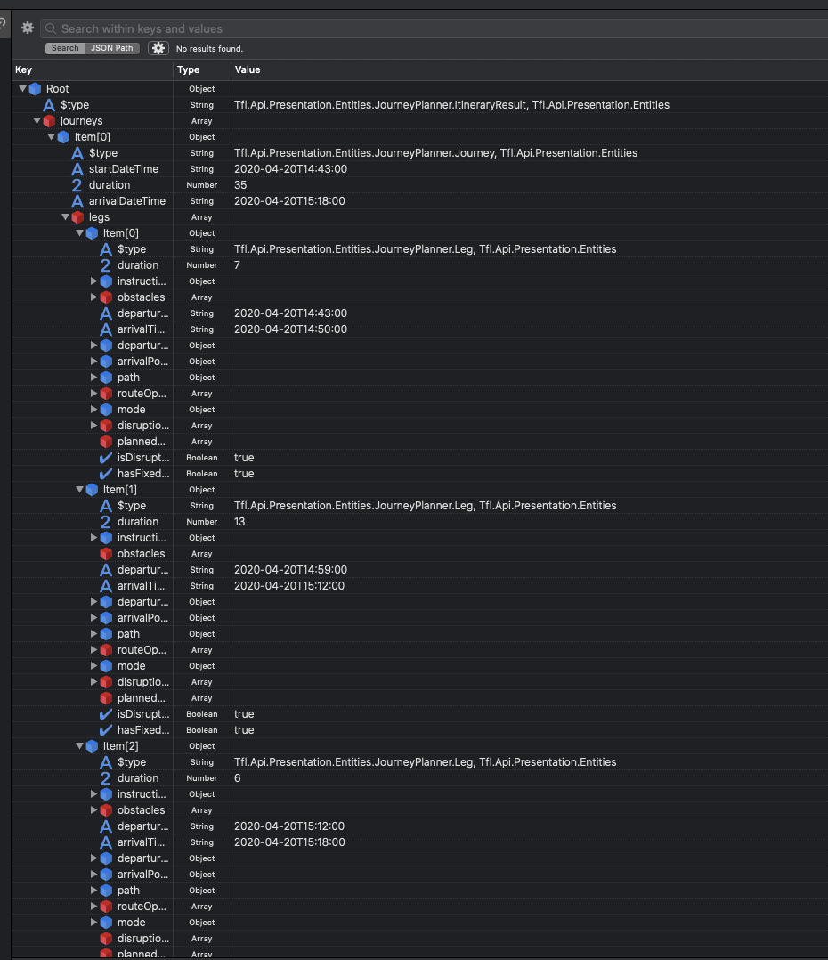
I notice that the journey planner duration results are a little confusing. The total journey duration is not equal to the sum of that journey’s leg durations.
Does this mean that the total journey duration takes into account the time spent waiting for the transport to arrive OR is this an error?
If it is the former and not a mistake then would it be possible to get another field within the journey leg indicating the expected time to wait for the transport also?
If I were planning a journey, I would want the actual elapsed duration to be shown from the time I board the first leg to the time I alight from the last leg, so if there is a 9 minute wait for a leg involved, I would expect that to be included.
There is a little known trap involved with duration though. It only affects high frequency periods of operation for bus services as far as I know, not low frequency or rail/tube services of any frequency.
If you specify a journey on a route which runs every 10 minutes, the duration presented to the passenger is the time on bus plus the 10 minute interval between buses. It is not at all obvious that this is being done. At least it is not obvious until the high frequency daytime service changes to low frequency evening service, at which point two successive buses arrive at your destination at roughly the same time!
One consequence is that any sensible passenger will already be factoring in some waiting time, so will get an inflated and off-putting impression of how long it would take. If you want to make a journey using three high frequency services it will add half an hour on!
Another consequence can be observed by looking for buses form Enfield Town to Chase Farm Hospital, with three alternatives which leave from three stops in different roads. Two are low frequency, one is not. During the day Journey Planner usually advises using one of the low frequency services because adding in the interval for the high frequency service appears to make it arrive later! Illogical, captain! In reality, the high frequency service is the best best unless a low frequency bus is almost due.
It has clearly been set up this way by design but the logic completely escapes me.
Thank you for the response. I take onboard that the journey planner has been designed this way. However, surely a new attribute could be introduced which could hold the expected wait time for each leg no?
This would make the presentation of the Journey Planner results make much more logical, we could have the total journey equate to the sum of all leg durations + leg waiting times.
Is this not possible? Apologies if I missed something in your previous response.
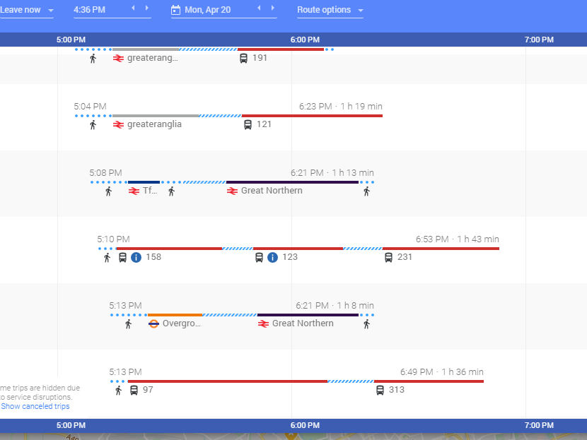
The need to wait for interchanges is much more obvious when you use the Google Maps planner. The output shows walking (dotted) and waiting (barber pole) as different
I note with interest that the Google maps system moves the walk to the first place of the journey to show the “last possible leaving time” for the walk to the first.
The reason I ask is because the program I’m developing uses the Unified API. If I was to use the Google Maps planner I would have to make major code changes if its possible to integrate with it. So I was wondering about the possibility of adding the new field to the Journey Planner API within the Unified API?
Sorry, I wasn’t suggesting you change, I just thought it was a useful way of illustrating the point made by @mjcarchive
Of course, you could do what I did for one of my apps and hit four journey planners in parallel (TfL, Citymapper, National Rail Enquiries and Google Maps API) to pick the best one!
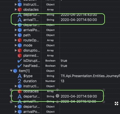
Of couse, it is possible to work out the “wait gaps” from the provided data. It’s just a case of spotting the differences between the arrivalTime of each items against the departureTime of the next item.
My main point (OK, not totally germane to the original question) is that some waiting time is being hidden within the duration.Some barber’s pole within the red, so as to speak. (BTW, how do you get to the Google Maps planner?)
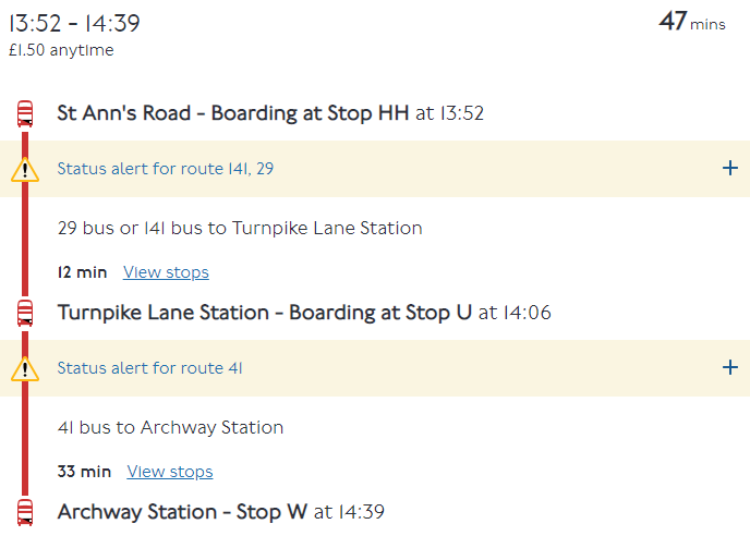
Example of a request to Journey Planner next Sunday:-
We know from London Bus Routes 29/N29 timetable that the bus 29 leg should take 4 minutes. Oh look, JP says 12, which happens to be 4 minutes plus the service interval on the 29 (not even the combined service interval on the 29 and 141, I note).
From London Bus Routes 41/N41 timetable we know that it should take 21 minutes to get to Archway on the 41. JP has added a further 12 minutes.
So you end up with a rather ridiculous 47 minutes, of which 25 minutes is actually on buses, 2 minutes shown as waiting time at Turnpike Lane (admittedly optimistic for changing between high frequency services) and 20 minutes bogus waiting time masquerading as on-bus time.
No wonder people think buses are slow, really slow.
Go to https://www.google.co.uk/maps and plan a journey (pick a place, then pic “Direction to” etc etc)
Pick “Public Transit” icon at the top (icon of a train)
At the bottom of the sidebar on the left, there is a link…
This might just be because buses are, legally, allowed to run up to 5 minutes later, and in reality don’t often run 100% on time. By making allowances for the fact that in the real-world buses don’t run to the schedule, you are giving a more realistic journey plan?
But the same is true for low frequency bus services (and to some degree on other modes) and no allowance at all is included for that. On one of my local routes it is not uncommon to see two buses together when the service interval is supposed to be every 20 minutes!
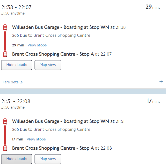
When the service changes from high to low frequency you get results like this:-
Is it not also the case that the factors you mention could work in the passenger’s favour by knocking several minutes off the interchange time? It
The biggest issue for me though is the total lack of transparency over what is being done. Is there a difference to spot on the two route 266 journey results? A seasoned traveller would add some extra time in at the start of the journey and at the interchange over and above what Journey Planner says and they could still be doing this oblivious to JP having already hidden a lot of extra time within the on-bus element of the duration.
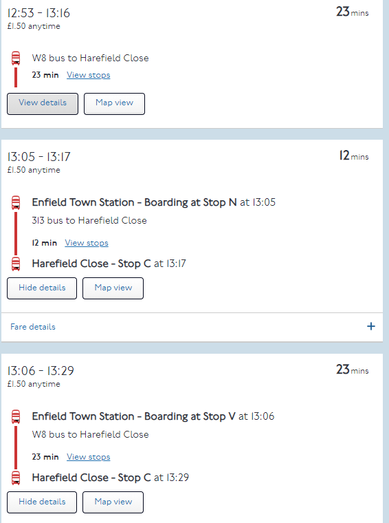
I touched on the baleful effect on passsnger decisions where high and low frequency alternatives are available. Consider this:-
In reality the two routes take the same time for the journey. “I won’t get the first W8 because the 313 gets there at the same time. The 313 is obviously better than the second W8 because it is so much quicker”. No it isn’t! The stops served are some way apart so you have to make a choice and the W8 is nearly always the better choice because of its frequency but that frequency makes it look quite often to be the worse choice. A slight tweak in the criteria would bring the W9 (from a third stop) into play, which would make the W8 look even worse.
Thanks for the Google Maps link. I will look at the same journeys there, though I presume all they do is repackage Journey Planner’s own results.