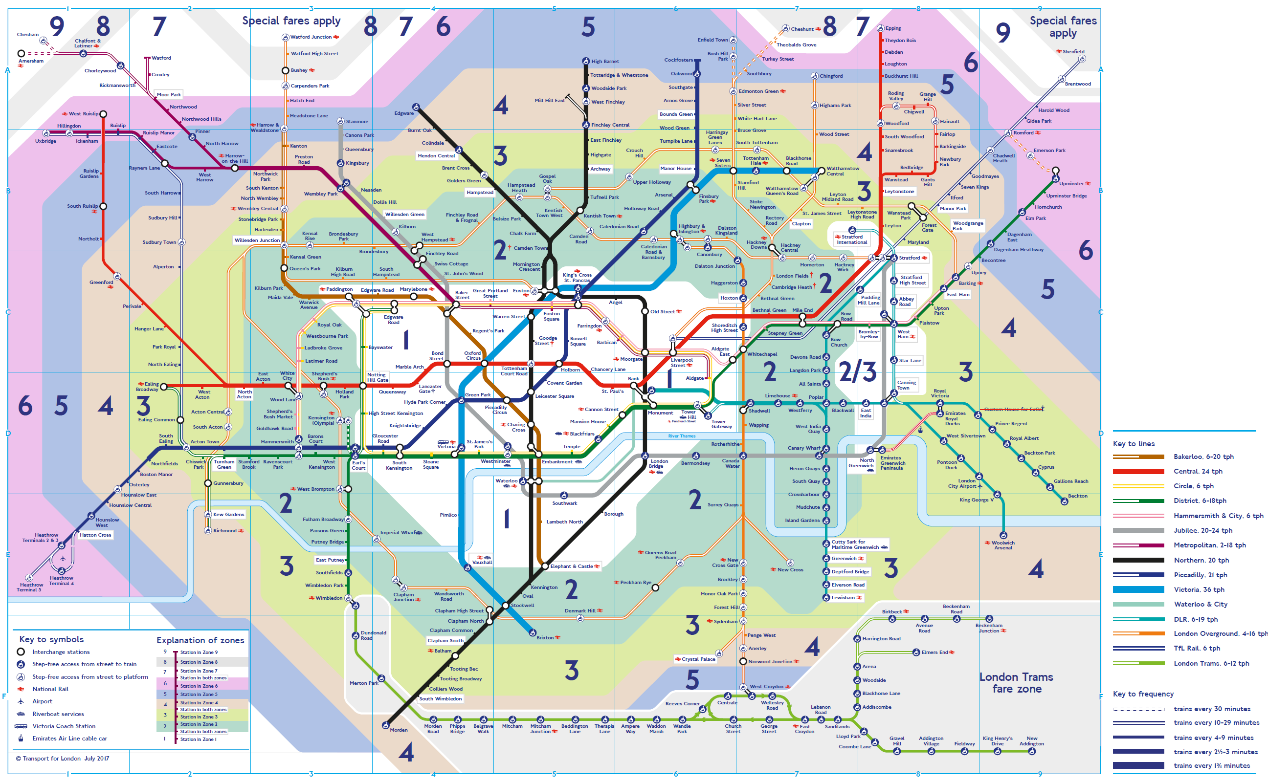
This isn’t quite right, but it’s been done by hand (in CorelDraw!) from the data that I have from TfL about passenger interchange numbers.

The idea, which I think can understand better with the design grid showing below, is that the grid points on the diagram represent all of the interchange stations: those between tube lines and those with National Rail connections.
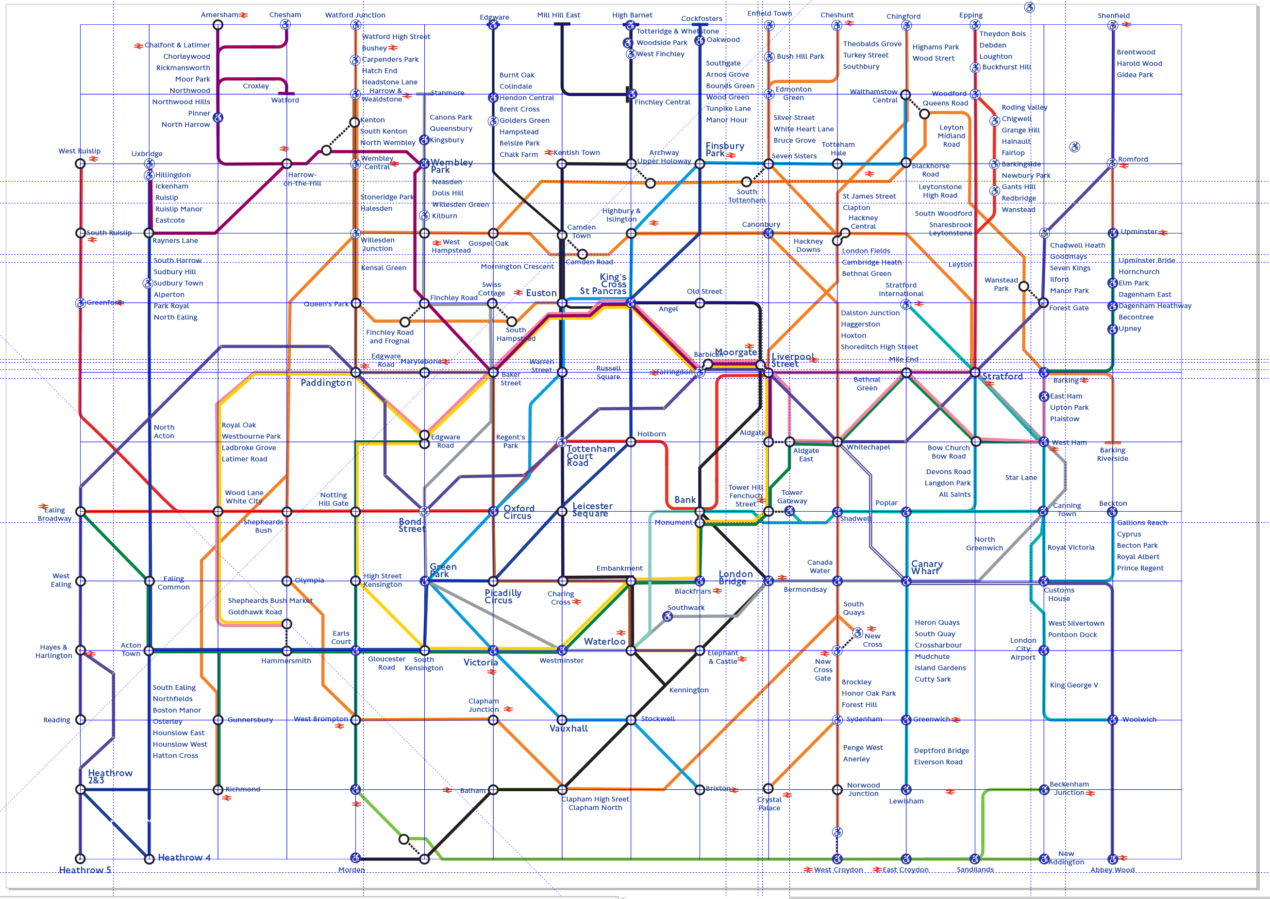
The idea is to keep all of the conventions of the current diagram, but show the changes that adding the Elizabeth line (aka Crossrail) and making long runs of station names as vertical lists to assist with comprehension.
The idea was that the whole diagram would be produced programmatically, which is why there are many unconventional lines. However, it does make seeing the interchanges, especially the high-usage ones, clearer.
Or am I trip to nowhere with this?
I would also like to be able to include the train frequency information - taken from the timetables - in the diagram too