I thought I’d share this visualisation, it’s pretty janky but still fun. You can see all the trains on the network at 10pm on Sunday evening. I knew the tube was incredible, but this really makes it clear. Thank you TFL!
https://youtu.be/W5oeWFbuZfc
2 Likes
@grahamwell Nice work!
Of course, the tube trains tend to accelerate to their top speed from stationary and spend a lot of time “dwelling” and it’s hard to show that on a diagram (rather than a geographical map).
Of course the Working Timetables (WTT) - Transport for London says…
| Summary | distance | mins | km/h |
|---|---|---|---|
| Bakerloo | 23.23 | 48.0 | 29.0 |
| Central | 73.72 | 113.5 | 39.0 |
| Circle and Hammersmith and City | 39.56 | 86.0 | 27.6 |
| District | 61.38 | 119.5 | 30.8 |
| Jubliee | 36.34 | 56.5 | 38.6 |
| Metropolitan | 65.91 | 95.3 | 41.5 |
| Northern | 63.35 | 106.8 | 35.6 |
| Picadilly | 70.55 | 125.0 | 33.9 |
| Victoria | 21.25 | 29.8 | 42.7 |
| W&C | 2.22 | 4.0 | 33.3 |
From the opening post I was expecting to see a representation similar to Live London bus map
- that works well because it’s simple, clear and obvious where the buses are, so it needs no explanation
- I can forgive it for showing buses traveling “as the crow flies” between bus stops on bends, and sometimes apparently reversing back to the previous bus stop when there’s a mismatch between predicted and reported positions, because both are understandable limitations taking into account the nature of the real time data that it is based on
- by clicking on a bus or hovering over a stop, I can see more information
- it all seems to be well thought out and optimised for the intended purpose of seeing the buses
But I can’t work out where the trains are in this video. Only the tube lines are completely obvious. I’m guessing that the dots are stations rather than trains, but I could be wrong because it’s all too fuzzy to work anything out for sure, and the panning and zooming prevents watching to see if they move. And why do we have what I presume are ventilation shafts jumping out in an apparent third dimension from the tracks? They seem to be adding unnecessary visual clutter that distracts from seeing what is going on.
Is the original page available at a higher resolution online somewhere, and preferably in an unpanned but user-zoomable version more like that of the bus version?
1 Like
Don’t know what to say really. If you liked the live bus map then you’ll love the tube version
https://traintimes.org.uk/map/tube/
This is not that.
The “ventilation shafts” are the souls of the trains ascending into heaven ![]()
1 Like
That’s really cool – thanks for sharing!
We have a similar visualisation that we use internally, but only in 2D. Our old headquarters had these paper discs that visualised the state of the network. Modern technology makes it a lot easier to assess at a glance what’s happening on the network.
Thanks for that. From it I found Live map of London Underground trains (different URL, same title text) which is possibly more useful. Though I’m a bit worried about the number of head-on crashes that I witnessed in just a few seconds of viewing after zooming in on a small part of the network. The accident investigators must be very busy today ![]()
Don’t know what to say really. If you liked the live bus map then you’ll love the tube version
https://traintimes.org.uk/map/tube/
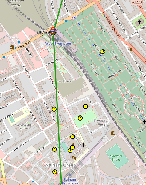
I love it, but I don’t understand it. There appear to be an implausibly large number of trains between Fulham Broadway and West Brompton, over half of which are ignoring both the physical railway line and the tube map representation and taking a short cut through Brompton Cemetery, avoiding West Brompton and Earls Court entirely.
Is this data really coming from the TfL API? It’s a bit concerning if it is.
I’m sure the data is “coming from” the API. But bear in mind that the API mostly shows predictions, not reality. There isn’t, sadly, an API which shows the current GPS co-ordinates of each bus “right now”. And also bear in mind the API shows only arrivals, not departures.
Consequently, the live bus and tube maps have to do a lot of “guessing” (aka interpolation), So if the API says the vehicle has arrived at the terminus and is predicted to arrive at its first stop in 110 seconds and it takes 70 seconds to reach that stop, then it will probably plot the bus position making the assumption that the bus will leave 40 seconds later and will travel at whatever uniform speed is needed to reach the stop at the predicted time.
Predictions are rarely reality, and the one thing the API seems not to know is that the driver is still eating his sandwiches and is therefore not going to depart at the predicted time. A couple of minutes later, a new prediction will be issued showing that the vehicle is still at the terminus. Here the strange thing is that the map plots the bus apparently reversing back to the terminus in order to start plotting from a newly-guessed departure time,
This sequence may be repeated several times before reality catches up, the API shows the vehicle has actually reached the first stop and the map plots the vehicle continuing after a suitable delay to the next stop.
Example (for the bus version): I’ve stood at Stop D at Brimsdown, where it’s possible to see the bus in the terminus. The map shows the bus leaving the terminus, but the bus itself stays firmly put. The problem seems to be that the live map knows more about where the bus ought to be than the driver does. Indeed, I suspect many times the driver is still on his way to the portaloo on the other side of the railway line when the live map shows (and all the API predictions) presume the bus to have departed.
It all boils down to one of the API’s failings: that it shows where it hopes the vehicle is, and does not report when the vehicle actually did leave the depot or stop, or precisely where it is now.
Add to that the live map, for computational simplicity, assumes that vehicles travel in straight line between stops and it’s clear why it shows in the way that it does. Despite those limitations, it’s still quite informative. You can, for example, see buses bunching up at peak periods
Matthew Somerville’s live tube map - I believe - uses the TFL api (not Trackernet) and if you look closely you’ll see that the trains follow straight lines between start and destination stations. It doesn’t always get this right, so sometimes (quite often actually) trains appear to cut cross-country, they are following straight lines but from the wrong starting point. That’s another difficulty with the arrivals API, it doesn’t tell you where the train has been, just where it’s going.
Those trains cutting through Brompton Cemetery are actually on a straight line between Fulham Broadway and … Edgware Road, which it seems to think is the next stop.
Harry’s right about the bus arrivals. They’re driving me potty. They wobble about wildly, showing a bus four stops ahead, then changing their minds, back two, nothing for a minute or so and then … whoosh, four stops ahead again. I guess that TFL are taking the GPS data and adding some estimate of where the bus will be when the API update is requested, which is a little bit flakey.
Basically … bugs ![]()
Looking at the live tube map right now, from my lofty perch overlooking the outer reaches of the Metropolitan line I can confirm that Map is … completely wrong, it’s making up trains and missing the ones that actually exist.
If you want to do this accurately you need real time positioning information. This does exist, for the Tubes it’s Trackernet and there’s a good, pretty accurate example of it being used to deliver position information here (sadly not on a map):
For buses I think this information is also available, but not from TFL. Bus Open Data provides GPS information and there’s an example of this being used to plot positions on a map here:
https://bustimes.org/
An example map which you can pan and zoom
https://bustimes.org/map#14/51.601/-0.397
I haven’t explored this so can’t comment on whether it’s really accurate, but my friendly local bus geek assures me that it’s pretty good.
The source code for Matthew Somerville’s live maps (which I’m a big fan of) is available on GitHub. You’ll see that it uses the Unified API for Tube and Countdown for buses.
Although you cannot get live bus GPS data from TfL directly, we provide a feed to the Department for Transport, who republish it on our behalf through their Bus Open Data Service (BODS).
If you would like access to this data, we encourage you to sign up on their website for a free API key. Then, you can make an HTTP request to the following URL to receive live location data for all TfL buses in SIRI-VM format:
https://data.bus-data.dft.gov.uk/api/v1/datafeed/?operatorRef=TFLO&api_key=YOUR_KEY_HERE
I assume this is what bustimes.org is using for their live map.
bustimes.org has a link on their homepage which shows you the data sources that they use. It’s quite a good index of available sources
Data sources – bustimes.org
I was put off Bus Open Data by … frank incomprehension as to how the route numbers were mapped from the TFL numbers … eg the 282, to what seems to be their own internal numbering code - which is 176. I couldn’t figure out how you’re supposed to know this. Any ideas?
First of all, small disclaimer that although we will try our best to assist, more formal support for BODS may be obtained from the BODS Help Desk or the official BODS Discord server.
As you’ll have seen, the SIRI-VM data from BODS looks like a bit like the following:
<MonitoredVehicleJourney>
    <LineRef>176</LineRef>
    <PublishedLineName>282</PublishedLineName>
</MonitoredVehicleJourney>
LineRef is actually the internal ID for a bus route in our iBus system. I don’t think we otherwise expose this ID anywhere else in our open data, so it probably wouldn’t be useful to open data users.
PublishedLineName, on the other hand, is the customer-facing bus route number. So this is probably what you should be using.
The one drawback I can see is that although the BODS API allows you to filter by LineRef, there doesn’t seem to be a way to filter by PublishedLineName. Therefore, even if you are only interested in particular bus routes, you must download the entire TFLO dataset (unless you maintain your own mapping somehow). If you would like to be able to filter by PublishedLineName, it may be worth providing this as feedback to the BODS team.
1 Like
Thanks Leon, I will provide feedback along those lines. All that’s really needed is a spreadsheet or flat file database that would allow a query to map from the PublishedLineNames to the LineRefs. I’m sure there must be such a thing somewhere. If not I’ll have to make it. Because I’m writing a phone app, I don’t want do download any more data than I have to,
The trouble with a spreadsheet or flat file database is that it would become outdated whenever we add a new bus route.
At first I thought you could just download the entire TFLO dataset once a day and generate a mapping based on that. However, it only gives you data for buses that are active on the network at the point in time you make a request. I’m not sure there’s any particular time of day when every bus route is active, so it’s a bit tricky… ![]()
I’ve emailed BODS and will see what happens. I can’t believe I’m the first to have this issue.
I take your point about a spreadsheet getting out of date, but … what’s the alternative?
What would be incredibly helpful would be to include this iBus reference in the [line] class, that is returned from a variety of API calls, in particular the /place query. That returns lines serving a particular geographic point and from there I can work out bus lines, but only the published name. There’s quite a lot of duplication in the [line] class, for example id, name and uri seem to return basically the same data - the published line name.
Anyway, let’s see what BODS say. Thanks again for your help.
Graham
1 Like
Entirely new bus routes are rare and there is plenty of advance publicity so someone external maintaining a spreadsheet ought not be too onerous (even better if someone internal!). Withdrawn routes only matter if LineRef is then recycled.
Except … what about variants of the route which are given different internal route numbers within parts of the TfL system (N6, 25U, Y36, 108D and the V prefix used during Covid). Do they all have the same PublishedLineName and LineRef on BODS? Then there are the assorted rail replacement services (UL…) if they are of interest.
One potential approach would be to run a script that fetches the TFLO dataset periodically (say, every hour) and gradually build up a mapping over time. Something like this Python script I’ve hacked together:
import requests
import sqlite3
from xml.etree import ElementTree

API_KEY = 'YOUR_API_KEY'

con = sqlite3.connect('line_mapping.db')
con.execute('''
    CREATE TABLE IF NOT EXISTS line(
        LineRef INTEGER PRIMARY KEY,
        PublishedLineName TEXT UNIQUE
    )
''')

response = requests.get(f'https://data.bus-data.dft.gov.uk/api/v1/datafeed/?operatorRef=TFLO&api_key={API_KEY}')
root = ElementTree.fromstring(response.content)
namespaces = {'': 'http://www.siri.org.uk/siri'}
for journey in root.findall('.//MonitoredVehicleJourney', namespaces):
    line_ref = journey.find('LineRef', namespaces).text
    published_line_name = journey.find('PublishedLineName', namespaces).text
    con.execute('''
        INSERT INTO line(LineRef, PublishedLineName) VALUES(:line_ref, :published_line_name)
        ON CONFLICT DO UPDATE SET LineRef=:line_ref, PublishedLineName=:published_line_name
    ''', {
        'line_ref': line_ref,
        'published_line_name': published_line_name
    })
con.commit()
con.close()
Eventually, it should contain all the routes with their LineRef and PublishedLineName values.
Unfortunately, the iBus data is essentially a different dataset to the one for the Line data in the Unified API (or the TransXChange data we publish). So it’s not straightforward to include the LineRef ID in the Unified API.
Timetable variations are still the same bus route, so in theory they still match the PublishedLineName (and therefore also the LineRef), but since they’re rather different datasets, it’s a little bit like comparing apples and oranges.
Spencer Brittain from BODS got back to me on my query. He’s produced an unofficial mapping BODS line codes to TFL Route numbers … in the form of a spreadsheet - which he stresses may not be exhaustive or permanent. He will reach out to TFL to see if something more robust can be delivered.
Is there any scope for uploading this spreadsheet here? Alternatively I can just paste the contents if anyone is interested. (there are 623 lines)
Edit: Here’s the link
Just as a one-off, here is the current mapping, though please still treat this as unofficial:
https://bitbucket.org/transportforlondon/workspace/snippets/g7e7g7
Also note that this will become outdated in due course.
You’ll notice from this that there is a one-to-many relationship between PublishedLineName and LineRef. Some bus routes are operated as separate day and night services which have different LineRefs but we present them as the same bus route number to customers so they have the same PublishedLineName.
@LeonByford
That’s neat! I presume that a regular route will maintain the same BODS line code indefinitely. The difficult ones will be the ones which drop in and out - the Notting Hill Carnival specials (Y prefix?), the tube replacement routes (UL prefix), most of which are absent because they are not running this week, tube replacement extras (U suffix) on regular routes and any temporary routes for diversions. Would these irregular routes keep the same BODS line code whenever they reappear, I wonder?