New user. I just want to know why there is such a discrepancy between a.) TfL website b.) Google maps c.) what actually happens. Like most, I use Google maps to plan transport, but the information displayed by gooogle is becoming less accurate over time.
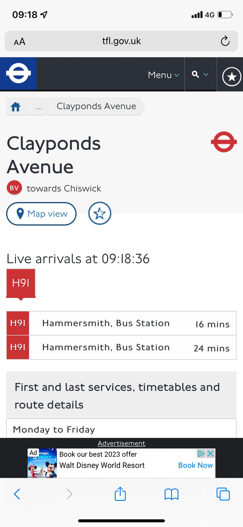
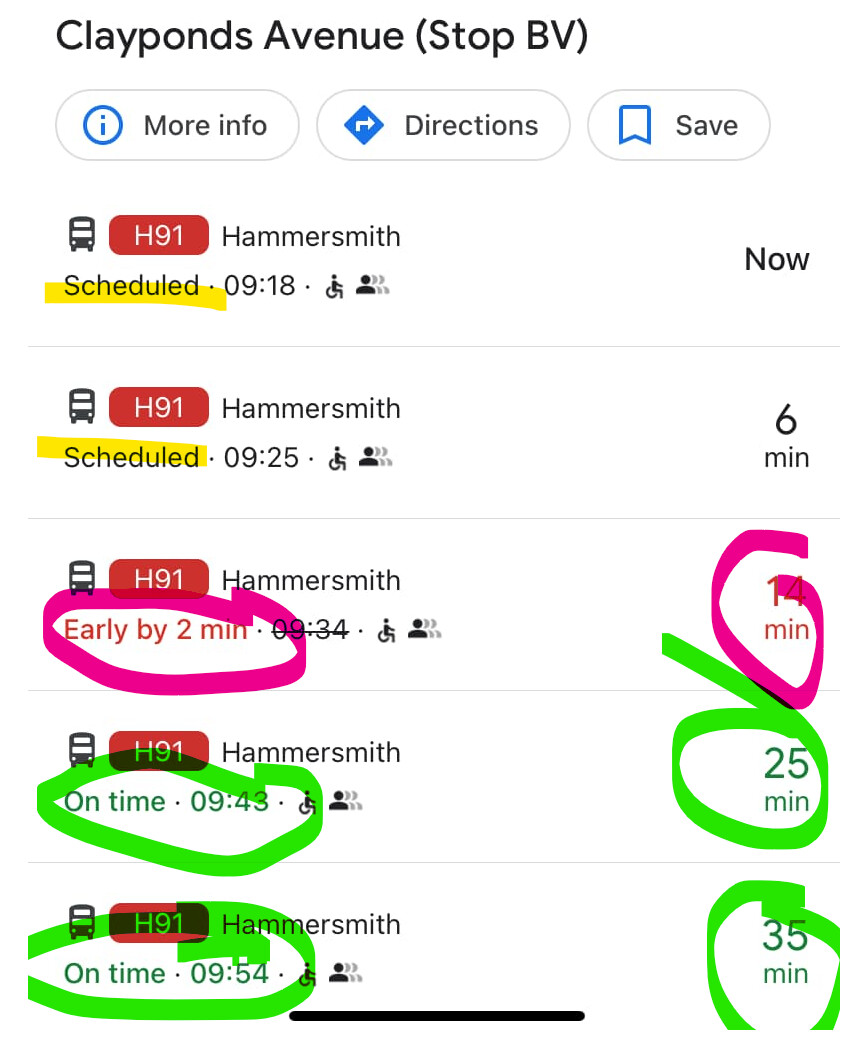
This morning, this is what I am shown on Google and TfL.
the images seem to be within a minute of each other. Green on Google maps means “on time” and Red means “not on time”.
How do you know that the bus in 6 minutes on Google is wrong? Google is showing you that it’s in the timetable, the TfL information is just the live data, not the timetable (in that view).
My understanding is that Google should display the actual timings, not the scheduled service, hence the “2 minutes early” for the bus in 16 minutes. The “Now” bus and the bus in 6 minutes did not turn up. Meaning Google is incorrect. This is not an isolated incident.