Hi. I wonder if there are any plans to improve the maps on the TFL website. For example the Tube Map here.
At present, the map appears in a small box on the page and is quite difficult to use. For a start it only occupies about 10% of the total screen area. In order to read the text you have to zoom in with the buttons. And then you see such a small fragment of the map that you lose all context.
The de facto standard for maps on the internet is Deep Zoom. Essentially it’s a collection of map tiles with different zoom levels and a bit of javascript to manipulate them on the page. The result is a map that you can freely drag around and zoom in and out at will. It’s what you see in Google Maps and all similar applications.
Here is a demo of what it would look like using Deep Zoom. I think it’s a lot easier to use.
Thanks for your comments @briantist. Yes, the picture I am looking at is an image, but it’s not a low res thumbnail. It’s 2481*1892 and the text is perfectly readable. It’s just really awkward to use because it’s displayed in such a tiny window.
The other map you linked to on the status page is an SVG as you say. However, this doesn’t make it any more usable. The zoom and panning behave just like the first one.
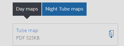
Downloading the map as a PDF is good workaround for expert users. It’s what I’ve done for my own purposes. By default, big PDFs don’t play nicely on either my Android phone or my PC. No doubt I could change some stuff and add third party apps to improve it.
I’m thinking more about the general public and how they access the maps. They don’t want to be bothered with downloading PDFs then working out how to display them. They want a map that ‘just works’ in the browser. That is a full screen map that you can pinch and drag to see what you need.
Given that the PDF format was invited in January 1993 it’s not really an “advanced” feature. Most browsers and phones can use it native and you don’t need to be online, given the incomplete status of the 4G/5G project
This doesn’t address the lingering problem of the experience in the browser though.
I agree with @tenbob - the UX for maps on the site isn’t great. One big issue with downloading PDFs (however good a PDF can be) is that it breaks a pretty core feature of internet browsing: you don’t want to leave the browser and end up in a different app just to see a map.
I’d also be keen to hear from TfL about any development plan for the maps page in specific and the website in general. The ‘maps’ and ‘stations, stops, and piers’ sections seem like they need a little bit of love, certainly in comparison to the pretty nifty ‘plan a journey’ section.
(It could be that the plan is to take these bits of the website out of the ‘golden path’ for users since the map experience you demoed is replicated in the TfL Go app; it would be nice to know either way)
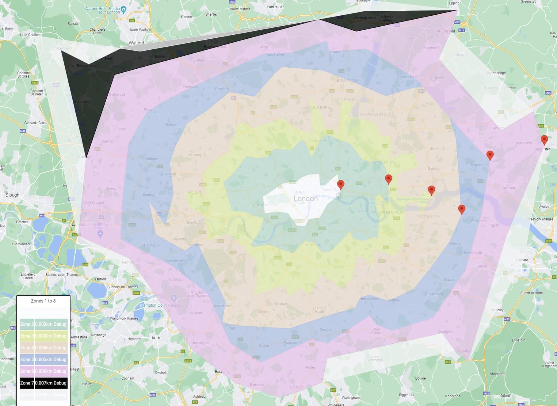
@briantist. Ironically, the latest map you cite, the Zone Map, displays all the nice features I was asking for in my OP. It’s a map that displays in the browser, it’s fullscreen, you can pinch and drag to see the bits you want. It’s a further example showing the benefits of Deep Zoom technology. If whoosh.media can do it, why can’t TfL?
I’m not here to criticize TfL as it’s their forum and I’m just to help my fellow programmers.
However, TfL is a very (small c) conservative organization. As much as I love watching (and visiting) the London Transport Museum Hidden London https://www.youtube.com/@ltmuseumvideo/videos the organization is very wedded to preserving it’s past victories.
One of these is the Harry Back Map - Harry Beck's Tube map - Transport for London - it has become so integral to the culture of TfL and the public that it’s almost incomprehensible in places.
the map has become a “symbol of London” and thus a symbol of the London government and it’s leaders.
There is a rather wonderful PDF (sorry!) “London Underground
Station Design Idiom” https://content.tfl.gov.uk/station-design-idiom-2.pdf which includes this version of the famous map on page 199 which explains the historical reasons for the lack of logic in station design
Hi everyone. Thanks for all the valuable feedback.
We are actively working to improve the user experience of the website. I’m currently leading a workstream that will make significant improvements to the Status section.
Although the Maps section is not our current focus, we are planning on improving its user experience in due course, so I have forwarded this feedback on to the relevant colleague so it can be taken on board.
Thanks @LeonByford. That’s what I was hoping for - engagement from TfL.
All the important info is in my OP, including this demo of what it would look like with improved control of drag and zoom.The rest is general chit chat.